5 Cutting-Edge CSS Features in 2024
In the last years, we've witnessed the emergence of several groundbreaking CSS features that are transforming how developers create user interfaces.
Let's have a look at some of these innovations by providing a comprehensive overview and practical applications.
The :has() Selector
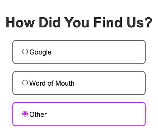
CSS's :has() selector marks a significant leap forward in styling capabilities. Previously, altering the style of a parent element based on its children required JavaScript or other, more complex, workarounds.
The :has() selector allows developers to apply styles to parent elements based on specific conditions met by their descendants.
For instance, styling a list item's border becomes effortless when its child input element is checked.
This feature not only simplifies the code but also enhances performance by reducing reliance on JavaScript. Browser support for :has() is robust, making it a reliable tool in modern web development.
<!-- HTML code -->

<ul>
  <li>
    <label> <input type="radio" name="source" />Google</label>
  </li>
  <li>
    <label> <input type="radio" name="source" />Word of Mouth</label>
  </li>
  <li>
    <label> <input type="radio" name="source" />Other</label>
  </li>
</ul>
/* radio button styling for checked input */
ul li input:checked {
accent-color: #f806e4;
}/* :has() selector for border styling */
ul li:has(input:checked) {
border: 2px solid #f806e4;
} Container Queries
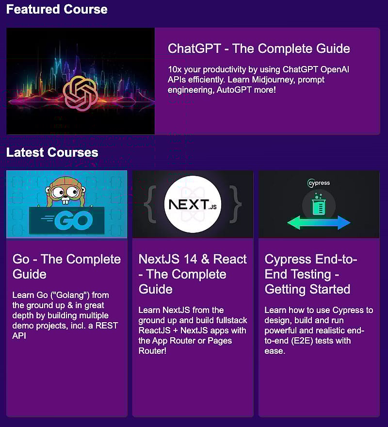
Container Queries allow components to adapt their layout based on the available space of their parent container.
This feature is particularly useful for reusable components like cards in a course section, where each component might need a unique layout based on the space it occupies.
These course cards are using the same component, depending on the space available of the parent container (the container wrapping the card) the layout is adjusted:
 By using
 @container and setting conditions like minimum width, developers can create more dynamic, responsive designs that utilize available space more efficiently.
Modern browsers fully support container queries, making them a vital tool for contemporary web design.
<!-- HTML code structure of individual component -->

<section id="featured-course" class="courses">
  <div class="course">
    <div class="course-card">
      <img src="./images/gpt-thumb.webp" alt="" class="course-thumb" />
      <div class="course-info">
        <p class="course-name">ChatGPT - The Complete Guide</p>
        <p>
          10x your productivity by using ChatGPT OpenAI APIs efficiently. Learn Midjourney, prompt
          engineering, AutoGPT and more!
        </p>
      </div>
    </div>
  </div>
</section>
Each section contains one or multiple .course-card elements. We use Flexbox to define a horizonal layout with the cards sitting next to each other.
/* display: flex to define space available for each individual card by aligning them horizontally */

.courses {
  display: flex;
  gap: 10px;
  justify-content: center;
}
The card element's wrapper becomes the container we run the container queries against. By using inline-size, it is sufficient to define the container's width.
/* added container-type property enabling container queries against this element */

.course {
  container-type: inline-size;
  width: 100%;
}

.course-card {
  display: flex;
  flex-direction: column;
  align-items: center;
  background: #620b79;
  border-radius: 5px;
  box-shadow: 1px 1px 1px #333333;
  width: 100%;
  height: 100%;
}
Element's inside the container can now be updated, depending on the space available for the container.
We use min-width: 400px to define updated properties for .course-card and .course-thumb once the container width surpasses this threshold.
/* @container to change properties depending on size of container */

@container (min-width: 400px) {
  .course-card {
    flex-direction: row;
    align-items: normal;
  }

  .course-thumb {
    width: 50%;
  }
}
CSS Nesting
CSS now supports nesting rules natively, a feature previously only available through pre-processors like SASS. Old style CSS looked like this:
.container {
  max-width: 800px;
  margin: auto;
  background-color: #f5f5f5;
  padding: 20px;
  box-shadow: 0 2px 4px rgba(0, 0, 0, 0.1);
  text-align: center;
}

.container h1 {
  color: #1a237e;
}

.container p {
  color: #757575;
}
Now nesting allows developers to write cleaner, more maintainable code by embedding selectors within one another:
.container {
  max-width: 800px;
  margin: auto;
  background-color: #f5f5f5;
  padding: 20px;
  box-shadow: 0 2px 4px rgba(0, 0, 0, 0.1);
  text-align: center;

  h1 {
    color: #1a237e;
  }

  p {
    color: #757575;
  }
}
This feature eliminates the need to repeatedly specify the parent selector, streamlining the process of writing CSS and making the codebase more readable. The latest versions of popular browsers offer excellent support for CSS nesting.
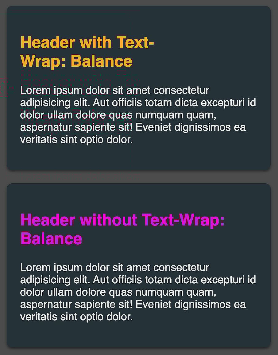
New Value for text-wrap: balance
The introduction of the balance value for the text-wrap property is a subtle yet impactful improvement.
It provides a more aesthetically pleasing text layout within elements by balancing the number of characters per line.
This feature prevents awkward breaks, like a single word dangling at the end of a paragraph, promoting a more visually balanced and professional look.
.balanced-text h2 {
  color: #ffa726;
  text-wrap: balance;
}

.unbalanced-text h2 {
  color: #fc01da;
}
Browser support for the
 balance is very good, allowing developers to incorporate it into their projects with confidence.
The :focus-visible Pseudo Class
The :focus-visible pseudo-class enhances accessibility and user experience by applying styles to elements that are navigated via keyboard (like using the Tab key).
This is particularly useful for distinguishing between elements focused through mouse clicks or keyboard navigation.
For example, it enables highlighting of a button when navigated via keyboard but not when clicked with a mouse.
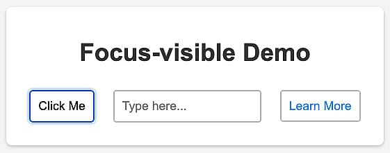 This feature addresses a common accessibility concern, making websites more user-friendly for keyboard navigators. The
 :focus-visible class is widely supported by browsers, making it an essential addition to modern CSS toolkits.
<main>
  <h1>Focus-visible Demo</h1>
  <button>Click Me</button>
  <input type="text" placeholder="Type here..." />
  <a href="#">Learn More</a>
</main>
button:focus-visible,
input:focus-visible,
a:focus-visible {
border-color: #1e88e5;
box-shadow: 0 0 3px 2px #1e88e580;
}Updating :focus-visible to :focus highlights the differences.
:focus will highlight the elements independently of the way it was selected (mouse click, tab on mobile device or using the tab key on the keyboard). :focus-visible highlights the input field for all devices, the remaining fields only when selected via the keyboard.