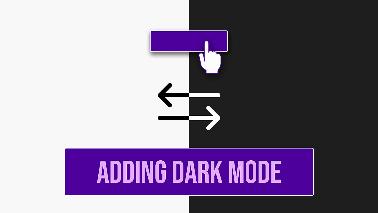
Switching Light & Dark Theme with CSS and Javascript
Ever seen a website that allows you to switch between a light and dark theme and wondered, how you can implement this feature on your website?
If you did, then this tutorial is for you.
There are multiple ways of implementing this feature on your websites or web apps. The easiest way to implement this feature is by using CSS variables and some Javascript.
In this tutorial, you will learn how to implement this feature by making a simple web page that contains a navigation bar and one main section.
At the end of this tutorial, you will have a web page which allows you to change its theme. Here's the final result:
First of all, lets write the HTML needed for this tutorial.
<body class="light-theme">
  <header>
    <nav>
      <ul>
        <li>
          <label class="switch">
            <i class="fas fa-adjust"></i>
            <div>
              <input type="checkbox" />
              <span class="slider round"></span>
            </div>
          </label>
        </li>
        <li>Home</li>
        <li>Services</li>
        <li>Contact</li>
        <li>About</li>
      </ul>
    </nav>
  </header>
  <main>Change My Theme</main>
</body>
Its simple HTML markup that contains a header element that contains the navigation bar and the main element that contains some text. You might have noticed the light-theme class added on the body element. It will be be used later to switch between the light and the dark theme. Also note that I have used an icon from fontawesome library, so make sure to include its CDN in the head section of the web page.
<head>
  ...
  <link
    rel="stylesheet"
    href="https://cdnjs.cloudflare.com/ajax/libs/font-awesome/5.14.0/js/regular.min.js"
  />
</head>
Now lets add some CSS to style our web page:
:root {
--navHeight: 70px;
}
* {
margin: 0;
padding: 0;
}
.switch {
width: 55px;
display: flex;
align-items: center;
justify-content: space-between;
}
.switch div {
position: relative;
display: block;
background: #eee;
width: 30px;
border-radius: 50px;
padding: 0 5px;
box-sizing: border-box;
cursor: pointer;
}
.fa-adjust {
transform: rotate(180deg);
}
.switch input {
display: none;
}
.slider {
background-color: #999;
transition: 0.4s;
border-radius: 34px;
height: 12px;
width: 12px;
display: inline-block;
position: relative;
}
input:checked + .slider {
transform: translateX(8px);
}
nav {
background: #d2cca1;
box-shadow: 0 0 4px rgba(0, 0, 0, 0.3);
font-size: 1.1rem;
position: relative;
}
nav ul {
list-style-type: none;
}
nav ul {
display: flex;
justify-content: flex-end;
align-items: center;
flex-wrap: wrap;
height: var(--navHeight);
padding: 0 10px;
}
nav ul li {
padding: 12px 10px;
cursor: pointer;
transition: background 0.3s ease;
border-radius: 4px;
position: relative;
}
nav ul li:hover {
background-color: #dedaba;
}
main {
display: flex;
align-items: center;
justify-content: center;
font-size: 3.5rem;
background: #e5c687;
height: calc(100vh - var(--navHeight));
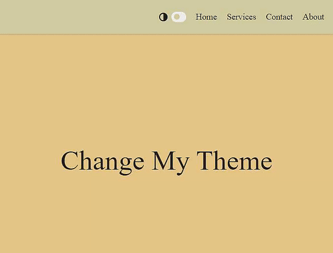
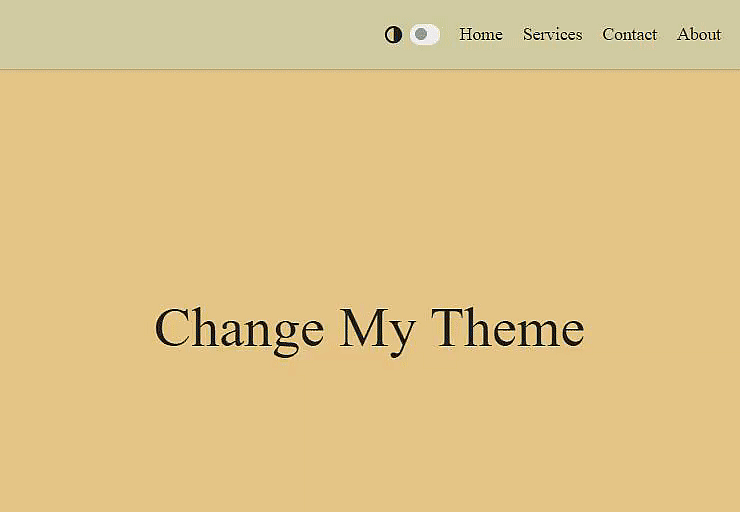
}At this point, out web page should like like this:
Now lets add some CSS variables in our CSS that will represent different colors in our webpage.
:root {
  --navHeight: 70px;
  --sage: #d2cca1;
  --paleSpringBud: #dedaba;
  --goldCrayola: #e5c687;
  --richBlackForeground: #0f1a20;
  --white: #f8f8f8;
  --black: #222;
  --msuGreen: #2d4739;
  --gray: #eee;
}
Lets add some more CSS variables that will represent colors for different elements in our web page for light and dark theme.
.light-theme {
  --themeDropDownBg: var(--goldCrayola);
  --themeIconBorderColor: var(--sage);
  --navBg: var(--sage);
  --navLinkHoverBg: var(--paleSpringBud);
  --mainBg: var(--goldCrayola);
  --fontColor: var(--black);
}

.dark-theme {
  --themeDropDownBg: var(--msuGreen);
  --themeIconBorderColor: var(--richBlackForeground);
  --navBg: var(--richBlackForeground);
  --navLinkHoverBg: var(--msuGreen);
  --mainBg: var(--msuGreen);
  --fontColor: var(--white);
}
Notice that instead of defining these CSS variables on :root, we have defined the same set of variables under .light-theme and .dark-theme. This is the trick to switch between light and dark theme using CSS variables. As CSS variables cascade downward, we will apply .light-theme and .dark-theme to the body element so that different elements on our web page are colored differently based on the class applied on the body element.
After adding the CSS variables, let now replace some of the hard-coded colors in our CSS with these CSS variables.
* {
  color: var(--fontColor);
}

nav {
  background: var(--navBg);
}

nav ul li:hover {
  background-color: var(--navLinkHoverBg);
}

main {
  background: var(--mainBg);
}
We are almost done. Now we need to write some Javascript code to add the .light-theme or .dark-theme classes on the body element when the theme toggle switch is clicked.
const themeSwitch = document.querySelector('input');
themeSwitch.addEventListener('change', () => {
document.body.classList.toggle('dark-theme');
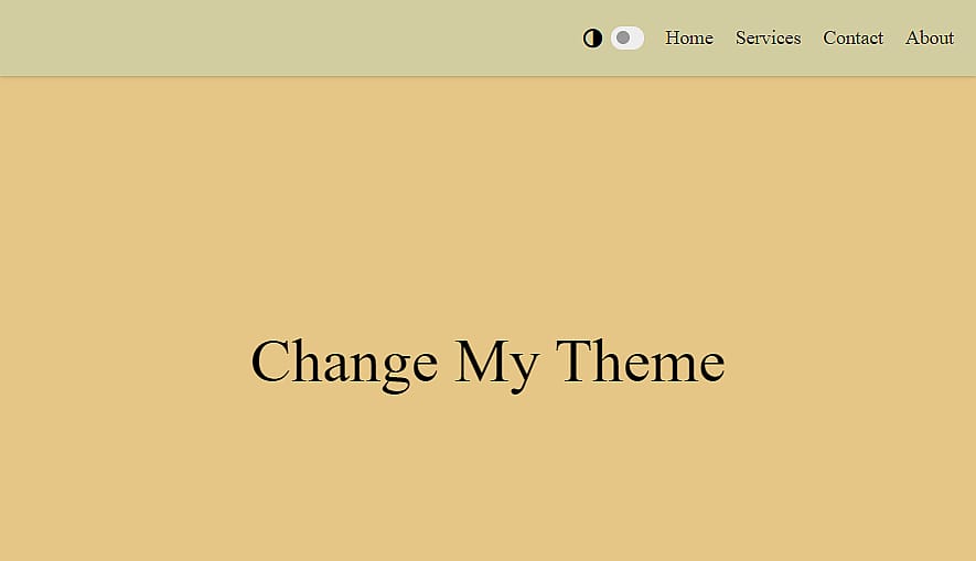
});At this point, we should have a working demo
Final Improvements
Our web page already looks cool but lets do some final improvements to make it look even nicer.
First thing I would like to improve is how our theme switches from light to dark and vice versa. I would like it to transition smoothly from one theme to another instead of instantly jumping from light to dark theme.
Lets add a transition on the background-color and color properties of each element in our web page.
* {
transition: background-color 0.6s ease, color 1s ease;
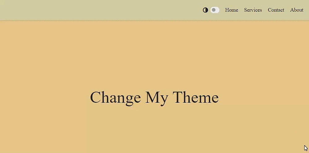
}The result of adding this transition can be seen below
Second thing I want to improve is the color of the theme toggle switch. Currently, it stays the same no matter which theme is applied. Lets make it so that it changes the color when the theme is changed.
To achieve this, we just need to add a CSS variable that holds the color for the theme switch. We have to add this variable in the .light-theme and .dark-theme classes.
.light-theme {
  --themeSwitchColor: var(--sage);
}

.dark-theme {
  --themeSwitchColor: var(--msuGreen);
}

.slider {
  background-color: var(--themeSwitchColor);
}
Now our switch changes its color according to the current theme

Possible Next Steps
That's it for this tutorial. There are some other improvements that could be made, for example:
- Making the navigation bar responsive
- One thing you might have noticed here is that currently our theme switches back to light theme when page is refreshed. We can avoid this by saving the current theme in
localStorageand when the page is refreshed, we read the current theme from thelocalStorageand set the appropriate theme class on thebodyelement
But i will leave the above mentioned improvements for you to implement. I hope you liked this tutorial.