What's the CSS Grid?
CSS Grid or Flexbox, which one should you use? Besides the video above this article, we'll also take a closer look at that question over the next few paragraphs.
To answer this question, let's first understand what exactly the CSS Grid is. It essentially allows us to create a layout for our page in which we can position HTML elements.
Such a layout is created by defining columns and rows, hence the CSS Grid is working with a two-dimensional space.
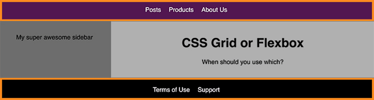
Here's an example:
This was achieved by turning the wrapping container - in this case the <body> element - into a grid by adding display: grid. Additionally, columns and rows as well as names for the created cells where defined.
You can learn all the details about how CSS Grid works in our "CSS - The Complete Guide" course.
Here's the final code for the <body> container:
body {
  display: grid;
  grid-template-columns: 30% auto;
  grid-template-rows: 60px auto 60px;
  grid-template-areas:
    'hd hd'
    'sidebar main'
    'footer footer';
}
Defining the grid layout is one step, the other important part is positioning the html elements. Here's the simplified CSS code (the full code can be found here):
header {
  grid-area: hd;
}

aside {
  grid-area: sidebar;
}

main {
  grid-area: main;
}

footer {
  grid-area: footer;
}
grid-area is a property that allows you to assign HTML elements to certain named cells/ areas defined via grid-template-areas.
As this example shows, the CSS Grid is awesome when it comes to creating complex layouts like these and positioning elements in it. Of course you can also easily add media queries and other cool features to it - again, check out our full course if you want to dive deeper.
What is Flexbox then?
The CSS Grid helps us with creating page layouts and positioning elements. What's the idea behind Flexbox?
Flexbox is also enabled via the display property. And just like CSS Grid, it helps us with the positioning of HTML elements.
Unlike the CSS Grid, it's about positioning elements in a one-dimensional space though - we got no rows or columns. We got only either of the two.
Here's an example:
<ul class="navigation-list">
  <li class="navigation-item"><a href="#">Posts</a></li>
  <li class="navigation-item"><a href="#">Products</a></li>
  <li class="navigation-item"><a href="#">About Us</a></li>
</ul>
.navigation-list {
list-style: none;
margin: 0;
padding: 0;
display: flex;
flex-direction: row;
justify-content: center;
align-items: center;
}The last four properties (starting with display: flex) are the important ones. These properties turn all elements with the .navigation-list class into Flexbox containers. flex-direction: row defines that we want to position child elements of this container in a row. justify-content and align-items define how the child elements will be positioned next to each other.
You can learn way more about Flexbox in the already mentioned course as well as the following awesome tutorial created by Manuel.
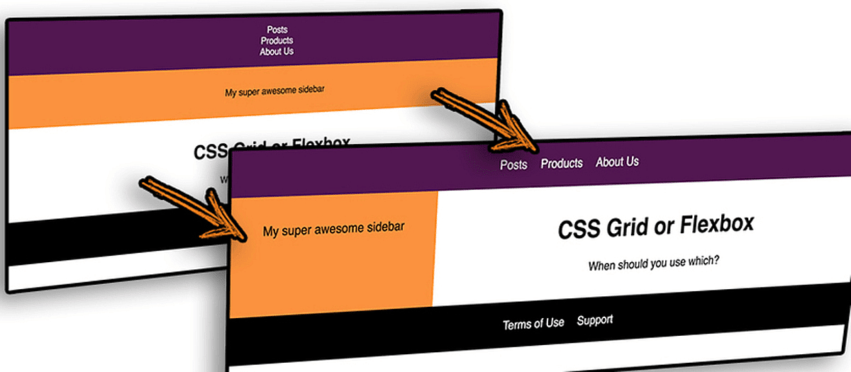
The above code positions the navigation items inside the <header> and <footer> of our page:
CSS Grid vs Flexbox
The last example does not only show how Flexbox is really helpful when it comes to positioning elements next to each other or below each other. It also shows how Flexbox and the CSS Grid can work together.
You create the overall layout with the Grid and use Flexbox to then position elements inside a cell - for all cases where you only need to position them in one dimension (row or column).
It's of course also possible to nest the CSS Grid inside of a Flexbox item. You could have a row of elements where one or all elements hold a more complex layout for example.
**The key differentiation really is the amount of dimensions you need to work with. **
Are you building a spreadsheet? You're working with rows and columns then, so CSS Grid probably should be your choice.
You're working on a list of users? Maybe Flexbox is your #1 tool then.
Mix and match both technologies as required and you'll be able to build really flexible and powerful user interfaces!