A Custom Hook for Managing Forms in React
There are many great libraries out there which can be used to create and manage form state in React. In this tutorial, we will learn how we can create a custom hook to manage forms in React without relying on any library.
We will create a hook that will not only render input elements in a form but also handle validation of the input elements.
For this tutorial, we will create a signup form which will contain the following input fields:
- name
- password
- confirm password
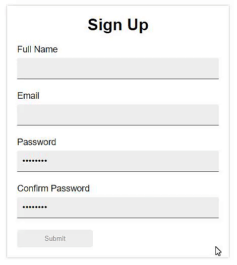
The following image shows the form that we will create.

A sidenote: The password fields had already been filled to demonstrate that the submit button is enabled when the overall form becomes valid.
Complete Code and Demo
You can find the demo and also access the complete code using the following link:
Note: You can learn all about React, from the ground up with our bestselling, 5*: React - The Complete Guide.
First of all, we need a component that will represent the input elements in our form.
Input.js
function InputField(props) {
  const {
    label,
    type,
    name,
    handleChange,
    errorMessage,
    isValid,
    value,
  } = props;

  return (
    <div className="inputContainer">
      <label>{label}</label>
      <input type={type} name={name} value={value} onChange={handleChange} />
      {errorMessage && !isValid && (
        <span className="error">{errorMessage}</span>
      )}
    </div>
  );
}
This InputField component expects different props that will be used to configure each input element which will be rendered in our form.
Each input has a label and an error message associated with it. Error message will only be displayed when the errorMessage prop contains a message to be displayed and the input field is not valid.
We also need some styles for our InputField component.
Input.css
.inputContainer {
  display: flex;
  flex-direction: column;
  margin: 0 0 15px;
}

label {
  margin: 0 0 6px 0;
  font-size: 1.1rem;
}

input {
  padding: 10px;
  border: none;
  border-bottom: 1px solid #777;
  background-color: #eee;
  outline: none;
  font-size: 1.1rem;
  box-sizing: border-box;
  margin: 0 0 8px 0;
}

.error {
  color: red;
}
As mentioned before, our hook will render input elements in the form. For this, we need to create an object representation of our form.
We will represent our form with the following object structure:
{
  renderInput: (handleChange, value, isValid, error, key) => {
    // return the JSX code that will
    // render the input component, passing
    // in the required props to Input component
  },
  label: 'input label',
  value: 'default value for the input',
  valid: false,
  errorMessage: "",
  touched: false,
  validationRules: [
    /* array of objects representing validation rules */
  ]
}
As there will be more than one input field that will be represented using the above object structure, we will create a helper function that will take some parameters and will return an object that will represent a single input field in our form.
import React from 'react';
import Input from '../components/Input';

/**
 * creates and returns object representation of form field
 *
 * @param {string} label - label to show with the form input
 * @param {string} name - input name
 * @param {string} type - input type
 * @param {string} defaultValue - default value for the input
 */
function createFormFieldConfig(label, name, type, defaultValue = '') {
  return {
    renderInput: (handleChange, value, isValid, error, key) => {
      return (
        <Input
          key={key}
          name={name}
          type={type}
          label={label}
          isValid={isValid}
          value={value}
          handleChange={handleChange}
          errorMessage={error}
        />
      );
    },
    label,
    value: defaultValue,
    valid: false,
    errorMessage: '',
    touched: false,
  };
}
The renderInput function will be used by our custom hook to render the InputField components in our form and pass in the required props to the InputField component. It takes the following parameters:
handleChange- a function that will be called ononChangeevents on theinputelementvalue- the value of the input fieldisValid- a boolean value that specifies whether the input field is valid or noterror- an error message to display if input field is not validkey-Inputcomponents will be rendered by our hook using a loop, so we need to pass akeyprop to eachInputcomponent
If you haven't noticed, the object returned by createFormFieldConfig function doesn't includes the validationRules property that was present in the previously written object structure. We will add that property in the objects, representing the input fields in our form, once we have written the validation rules. We will write those rules later.
Now lets create an object representation of our form. We will create this object in the same file in which createFormFieldConfig helper function was created.
// object representation of signup form
export const signupForm = {
  name: {
    ...createFormFieldConfig('Full Name', 'name', 'text'),
  },
  email: {
    ...createFormFieldConfig('Email', 'email', 'email'),
  },
  password: {
    ...createFormFieldConfig('Password', 'password', 'password'),
  },
  confirmPassword: {
    ...createFormFieldConfig('Confirm Password', 'confirmPassword', 'password'),
  },
};
Now we will write our custom hook. We will only write enough code in our hook to be able to use this hook in our form and render the InputField components using this hook.
We will write more code in our hook as we move forward in this tutorial.
import { useState, useCallback } from 'react';

function useForm(formObj) {
  const [form, setForm] = useState(formObj);

  function renderFormInputs() {
    return Object.values(form).map((inputObj) => {
      const { value, label, errorMessage, valid, renderInput } = inputObj;
      return renderInput(onInputChange, value, valid, errorMessage, label);
    });
  }

  const onInputChange = useCallback((event) => {
    // not yet implemented
  }, []);

  return { renderFormInputs };
}

export default useForm;
Now let's create a component that will represent our signup form.
SignupForm
import React from 'react';
import useForm from './useForm';
import { signupForm } from './utils/formConfig';

import './SignupForm.css';

export default function SignupForm() {
  const { renderFormInputs } = useForm(signupForm);

  return (
    <form className="signupForm">
      <h1>Sign Up</h1>

      {renderFormInputs()}

      <button type="submit">Submit</button>
    </form>
  );
}
We have imported the object representation of our signup form, created in a separate file and also our hook.
Inside our component, we have used the useForm hook, passing in the object that represents our form. From the object returned by our hook, we are destructuring the function named renderFormInputs that we will call inside our form to render the inputs.
And here are the styles for our form.
SignupForm.css
.signupForm {
  max-width: 400px;
  box-shadow: 0 0 4px rgba(0, 0, 0, 0.3);
  margin: 20px auto;
  padding: 20px;
}

.signupForm h1 {
  margin: 0 0 20px;
  text-align: center;
}

button {
  padding: 10px 15px;
  border-radius: 4px;
  border: none;
  box-shadow: 0 0 4px rgba(0, 0, 0, 0.4);
  width: 150px;
  background: blueviolet;
  color: #fff;
  cursor: pointer;
}

button:disabled {
  background: #eee;
  color: #999;
  box-shadow: none;
}
At this point, we have a form that uses our hook to display the Input components in our form.

We can't change the value of the input fields because we haven't yet implemented the onChange event handler inside our hook. We will implement this function once we have written some validation rules for the inputs in our form so that we can use those rules to validate the inputs and show the error messages when the user types any invalid value in any of the input field.
Each validation rule is basically an object that represents a rule that will be used by our hook to validate each input field in our form. Each validation rule will be of the following structure:
{
  name: 'name of the rule',
  message: 'error message to show when input validation fails',
  validate: <validation function>
}
We will write the following validation rules:
- required - each input field is required
- minimum input length - the value in each input field should at-least contain specified number of characters
- maximum input length - the value in each input field should not contain more than the specified number of characters
- password match rule - the values of the password and confirm password field should be equal
Lets create a helper function which we will use to create each validation rule.
/**
 * creates and returns a validation rule object that
 * is used by useForm hook to validate the form inputs
 *
 * @param {string} ruleName - name of the validation rule
 * @param {string} errorMessage - message to display
 * @param {function} validateFunc - validation function
 */
function createValidationRule(ruleName, errorMessage, validateFunc) {
  return {
    name: ruleName,
    message: errorMessage,
    validate: validateFunc,
  };
}
Now we will create the validation rules in the same file that contains the createValidationRule function.
export function requiredRule(inputName) {
  return createValidationRule(
    'required',
    `${inputName} required`,
    (inputValue, formObj) => inputValue.length !== 0
  );
}

export function minLengthRule(inputName, minCharacters) {
  return createValidationRule(
    'minLength',
    `${inputName} should contain atleast ${minCharacters} characters`,
    (inputValue, formObj) => inputValue.length >= minCharacters
  );
}

export function maxLengthRule(inputName, maxCharacters) {
  return createValidationRule(
    'minLength',
    `${inputName} cannot contain more than ${maxCharacters} characters`,
    (inputValue, formObj) => inputValue.length <= maxCharacters
  );
}

export function passwordMatchRule() {
  return createValidationRule(
    'passwordMatch',
    `passwords do not match`,
    (inputValue, formObj) => inputValue === formObj.password.value
  );
}
Each function calls the createValidationRule function, passing in the required arguments.
Each function, except the last one, i.e. passwordMatchRule, takes a parameter named inputName which is the name of the input with which this rule will be associated.
The minLengthRule and maxLengthRule functions also take a second argument which specifies the minimum and maximum number of characters respectively.
Each rule's validation function returns a boolean value.
The validation function for requiredRule checks if the value of the input field is empty or not.
The validation function for minLengthRule checks if the length of the input field's value is at-least equal to or greater than the specified number of characters or not. Similarly, the validation function of maxLengthRule checks if the length of the input field's value is less than or equal to the specified number of characters or not.
The validation function for passwordMatchRule checks if the values of the confirm password field and the password field are equal or not.
The validation function of each rule is passed two arguments:
inputValue- the value of the input field with which this rule is associatedformObj- an object representation of the form. In our case, this object is only used by the validation function ofpasswordMatchRule.
Now that we have written the validation rules, we will add these validation rules on the object representing our signup form.
import {
  requiredRule,
  minLengthRule,
  maxLengthRule,
  passwordMatchRule,
} from './inputValidationRules';

// object representation of signup form
export const signupForm = {
  name: {
    ...createFormFieldConfig('Full Name', 'name', 'text'),
    validationRules: [
      requiredRule('name'),
      minLengthRule('name', 3),
      maxLengthRule('name', 25),
    ],
  },
  email: {
    ...createFormFieldConfig('Email', 'email', 'email'),
    validationRules: [
      requiredRule('email'),
      minLengthRule('email', 10),
      maxLengthRule('email', 25),
    ],
  },
  password: {
    ...createFormFieldConfig('Password', 'password', 'password'),
    validationRules: [
      requiredRule('password'),
      minLengthRule('password', 8),
      maxLengthRule('password', 20),
    ],
  },
  confirmPassword: {
    ...createFormFieldConfig('Confirm Password', 'confirmPassword', 'password'),
    validationRules: [passwordMatchRule()],
  },
};
The confirmPassword field only requires the passwordMatchRule because it needs to match the value of the password field. So any rule that applies to the password field, automatically applies to the confirmPassword field.
Now we will write the onInputChange function in our hook.
const onInputChange = useCallback(
  (event) => {
    const { name, value } = event.target;
    // copy input object whose value was changed
    const inputObj = { ...form[name] };
    // update value
    inputObj.value = value;

    // update input field's validity
    const isValidInput = isInputFieldValid(inputObj);
    // if input is valid and it was previously invalid
    // set its valid status to true
    if (isValidInput && !inputObj.valid) {
      inputObj.valid = true;
    } else if (!isValidInput && inputObj.valid) {
      // if input is not valid and it was previously valid
      // set its valid status to false
      inputObj.valid = false;
    }

    // mark input field as touched
    inputObj.touched = true;
    setForm({ ...form, [name]: inputObj });
  },
  [form, isInputFieldValid]
);
This function is called each time any input in our form triggers an onChange event. It is wrapped in the useCallback hook to avoid creating a new function each time the state is updated and code inside this hook executes again.
This function uses another function named isInputFieldValid that returns a boolean value indicating whether the input field which triggered the onChange event, is valid or not. Lets write this isInputFieldValid function in our hook.
const isInputFieldValid = useCallback(
  (inputField) => {
    for (const rule of inputField.validationRules) {
      if (!rule.validate(inputField.value, form)) {
        inputField.errorMessage = rule.message;
        return false;
      }
    }

    return true;
  },
  [form]
);
This function is also wrapped in useCallback hook. This function takes an object representing an input element in our form and iterates overs its validation rules to validate this input by calling validate function of each validation rule associated with the input.
If the validate function of any validation rule returns false, we set an error message on the current input and return false from this function. If all validation rules are passed, this function returns true, indicating that input is valid.
Our hook is almost complete. We will now implement a function which will return a boolean value indicating whether the overall form is valid or not.
/**
 * returns boolean value indicating whether overall form is valid
 *
 * @param {object} formObj - object representation of a form
 */
const isFormValid = useCallback(() => {
  let isValid = true;
  const arr = Object.values(form);

  for (let i = 0; i < arr.length; i++) {
    if (!arr[i].valid) {
      isValid = false;
      break;
    }
  }

  return isValid;
}, [form]);
This function checks if there's any invalid input in our form or not. If there is, it returns false indicating that form is invalid. If all input elements are valid, it returns true, indicating that form is valid.
This function will be used in our SignupForm component to enable or disable the form's submit button.
Here's the complete code of our useForm hook.
import { useState, useCallback } from 'react';

function useForm(formObj) {
  const [form, setForm] = useState(formObj);

  function renderFormInputs() {
    return Object.values(form).map((inputObj) => {
      const { value, label, errorMessage, valid, renderInput } = inputObj;
      return renderInput(onInputChange, value, valid, errorMessage, label);
    });
  }

  const isInputFieldValid = useCallback(
    (inputField) => {
      for (const rule of inputField.validationRules) {
        if (!rule.validate(inputField.value, form)) {
          inputField.errorMessage = rule.message;
          return false;
        }
      }

      return true;
    },
    [form]
  );

  const onInputChange = useCallback(
    (event) => {
      const { name, value } = event.target;
      // copy input object whose value was changed
      const inputObj = { ...form[name] };
      // update value
      inputObj.value = value;

      // update input field's validity
      const isValidInput = isInputFieldValid(inputObj);
      // if input is valid and it was previously set to invalid
      // set its valid status to true
      if (isValidInput && !inputObj.valid) {
        inputObj.valid = true;
      } else if (!isValidInput && inputObj.valid) {
        // if input is not valid and it was previously valid
        // set its valid status to false
        inputObj.valid = false;
      }

      // mark input field as touched
      inputObj.touched = true;
      setForm({ ...form, [name]: inputObj });
    },
    [form, isInputFieldValid]
  );

  /**
   * returns boolean value indicating whether overall form is valid
   *
   * @param {object} formObj - object representation of a form
   */
  const isFormValid = useCallback(() => {
    let isValid = true;
    const arr = Object.values(form);

    for (let i = 0; i < arr.length; i++) {
      if (!arr[i].valid) {
        isValid = false;
        break;
      }
    }

    return isValid;
  }, [form]);

  return { renderFormInputs, isFormValid };
}

export default useForm;
Now lets use the isFormValid function is our SignupForm component.
export default function SignupForm() {
  const { renderFormInputs, isFormValid } = useForm(signupForm);

  return (
    <form className="signupForm">
      <h1>Sign Up</h1>
      {renderFormInputs()}
      <button type="submit" disabled={!isFormValid()}>
        Submit
      </button>
    </form>
  );
}
We have used the isFormValid function to determine whether the submit button should be disabled or not.
Final Result
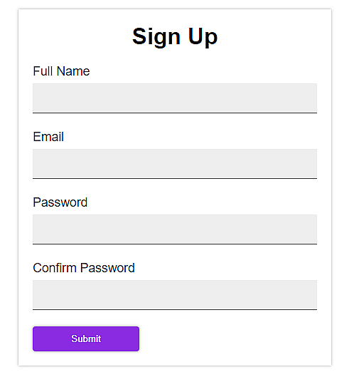
The image below shows the final result.
Side-note: The password fields have already been filled to demonstrate that the submit button is enabled when overall form becomes valid.

