What We'll Build
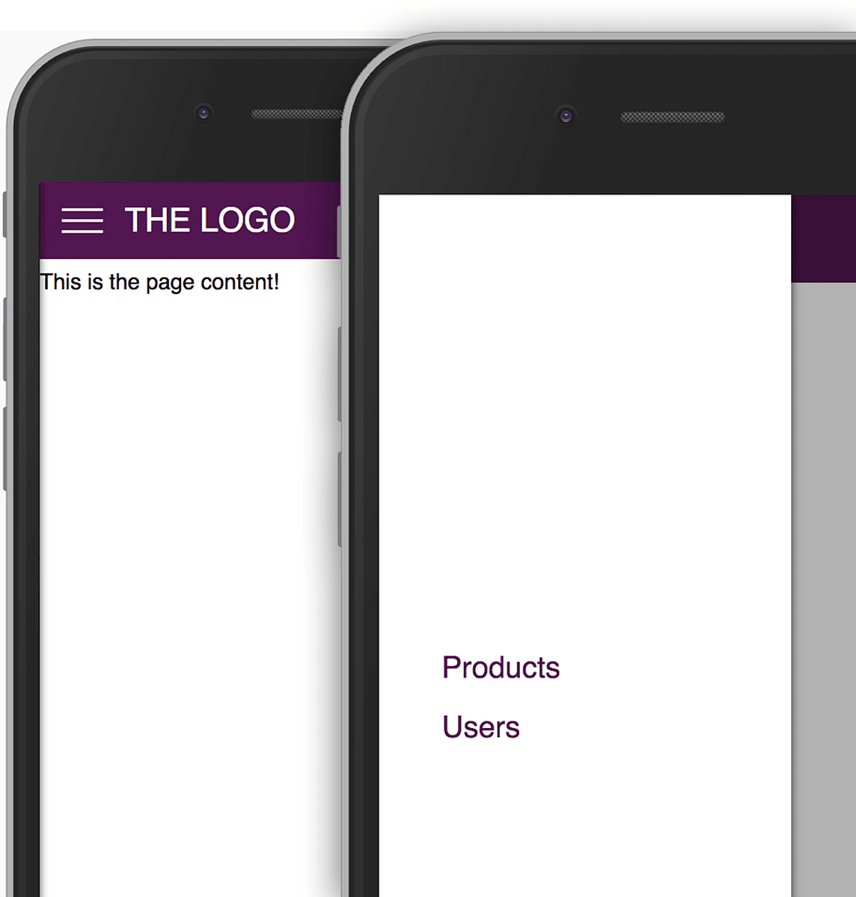
In this article (and video - see above), we'll build a responsive toolbar and side drawer with React.js.
Here's what it'll look like:
Adding a Toolbar
You can view the full video above this article and you also find the full, finished source code in the "Resources" section above this article".
As a first step, we'll use create-react-app to create a new React project. After installing the tool, you create a new project via this command:
create-react-app react-navbarLet's start by adding a toolbar. This will be a functional component that is decoupled from the side drawer (which we'll add later). If a "functional component" is not something you know, you might interested in learning the basics about React.js first, before diving deeper into this article.
The <Toolbar /> component is stored in a components/Toolbar folder in the project. Here's the code for the toolbar.
import React from 'react'

import './Toolbar.css'

const toolbar = props => (
  <header className="toolbar">
    <nav className="toolbar__navigation">
      <div />
      <div className="toolbar__logo">
        <a href="/">THE LOGO</a>
      </div>
      <div className="spacer" />
      <div className="toolbar_navigation-items">
        <ul>
          <li>
            <a href="/">Products</a>
          </li>
          <li>
            <a href="/">Users</a>
          </li>
        </ul>
      </div>
    </nav>
  </header>
)

export default toolbar
We got a wrapping <header> element and then a couple of containers for various elements in the toolbar. The first, currently empty, <div> will later be used for the toggle button for the side drawer.
The <div className="spacer"> element is important for the positioning of the containers on the toolbar. Since we use Flexbox for the positioning of child elements, the spacer (with the flex: 1 style) will ensure that the logo sits on the very left of the toolbar whilst the navigation items are pushed to the right.
The styling is added via the CSS import you see in the JS file (Toolbar.css). That CSS file is stored in the same folder. The build workflow provided by create-react-app supports such CSS imports into JS files.
In case styling is something you want to dive deeper into, we got a course for you.
Adding the Side Drawer
With the toolbar being added, it's time to also add the side drawer and a button that allows us to open that drawer. Both is stored in the components/SideDrawer folder in the project.
The <SideDrawer> component is a very simply component with just a bunch of lines of JSX code.
import React from 'react'

import './SideDrawer.css'

const sideDrawer = props => {
  return (
    <nav className="side-drawer">
      <ul>
        <li>
          <a href="/">Products</a>
        </li>
        <li>
          <a href="/">Users</a>
        </li>
      </ul>
    </nav>
  )
}

export default sideDrawer
The most important part here is the SideDrawer.css file which ensures that the drawer looks like a typical drawer and is positioned above the other page content.
This includes the <Backdrop />which is also added as a component (components/Backdrop).
This backdrop component also is just a <div> which is styled to act as an overlay for all the page content except for the side drawer. It's separated from that drawer because you could use that overlay for other components (e.g. some modal), too.
The Drawer Toggle Button
A <Toolbar /> and <SideDrawer /> are great building blocks but worthless without a button that combines them.
The <DrawerToggleButton /> component is exactly that.
This is how its code looks like:
import React from 'react'

import './DrawerToggleButton.css'

const drawerToggleButton = props => (
  <button className="toggle-button">
    <div className="toggle-button__line" />
    <div className="toggle-button__line" />
    <div className="toggle-button__line" />
  </button>
)

export default drawerToggleButton
Also not really that fancy. The interesting part is the styling (stored in DrawerToggleButton.css):
.toggle-button {
  display: flex;
  flex-direction: column;
  justify-content: space-around;
  height: 24px;
  width: 30px;
  background: transparent;
  border: none;
  cursor: pointer;
  padding: 0;
  box-sizing: border-box;
}

.toggle-button:focus {
  outline: none;
}

.toggle-button__line {
  width: 30px;
  height: 2px;
  background: white;
}
There, Flexbox is used to position the three "hamburger bars" vertically with the help of justify-content: space-around.
This yields a nice-looking hamburger icon. And we can now start connecting all the pieces!
Connecting the Building Blocks
The <Toolbar /> should hold the <DrawerToggleButton /> which should then show/ hide the <SideDrawer /> as well as the <Backdrop />.
Therefore, the toolbar is adjusted to hold the <DrawerToggleButton />:
<header className="toolbar">
    <nav className="toolbar__navigation">
        <div className="toolbar__toggle-button">
            <DrawerToggleButton click={props.drawerClickHandler} />
        </div>
        <div className="toolbar__logo"><a href="/">THE LOGO</a></div>
        ...
    </nav>
</header>
Note the click prop which is passed down to the <DrawerToggleButton /> component. It passes the value which the <Toolbar /> component receives via props itself: The drawerClickHandler - whatever that may be!
The <DrawerToggleButton /> expects that click property and assumes that it'll hold the reference to an executable function. This is the adjusted code for the button:
const drawerToggleButton = props => (
  <button className="toggle-button" onClick={props.click}>
    <div className="toggle-button__line" />
    <div className="toggle-button__line" />
    <div className="toggle-button__line" />
  </button>
)
With the help of onClick, clicks on the <button> are handled and will trigger the function reference received via props.click.
This just leaves one question: What's inside of drawerClickHandler - the value received in <Toolbar /> which is passed on to the button in the end?
The answer can be found in the App.js file - in the root app component which is stored there.
import React, { Component } from 'react'

import Toolbar from './components/Toolbar/Toolbar'
import SideDrawer from './components/SideDrawer/SideDrawer'
import Backdrop from './components/Backdrop/Backdrop'

class App extends Component {
  state = {
    sideDrawerOpen: false,
  }

  drawerToggleClickHandler = () => {
    this.setState(prevState => {
      return { sideDrawerOpen: !prevState.sideDrawerOpen }
    })
  }

  backdropClickHandler = () => {
    this.setState({ sideDrawerOpen: false })
  }

  render() {
    let backdrop
    let sideDrawer

    if (this.state.sideDrawerOpen) {
      backdrop = <Backdrop click={this.backdropClickHandler} />
      sideDrawer = <SideDrawer />
    }
    return (
      <div style={{ height: '100%' }}>
        <Toolbar drawerClickHandler={this.drawerToggleClickHandler} />
        {sideDrawer}
        {backdrop}
        <main style={{ marginTop: '64px' }}>
          <p>This is the page content!</p>
        </main>
      </div>
    )
  }
}

export default App
The value passed to <Toolbar /> is indeed a function reference. An address pointing at the drawerToggleClickHandler method. This method does switch the drawer state (should it be shown or not) upon every execution. It does so by using the function form of setState. This form ensures that the old state which is used to derive the new state takes all previous state updates into account.
Please note that another method reference (to backdropClickHandler) is passed to the <Backdrop />. This is done to provide a method of closing the side drawer (i.e. upon a click on the backdrop).
The sideDrawerOpen state is then used to either render the drawer + backdrop (via the if statement in the render method) or not.
Animating the Drawer
The current solution works but it does simply show/ hide the drawer. This is okay and fully functional but it's not necessarily the best possible UX we can offer.
Having some "slide-in" and "slide-out" animation for the side drawer would be nice.
Thankfully, this is easy to add!
Instead of using an if check to render or not render the sideDrawer variable, the <SideDrawer /> component should always be rendered. And then, the drawer itself should use CSS to show or hide itself.
Therefore, the information whether the drawer should be open (visible) or not, has to be passed down to the <SideDrawer />.
Here's the adjusted code in App.js:
render() {
    let backdrop;

    if (this.state.sideDrawerOpen) {
      backdrop = <Backdrop click={this.backdropClickHandler} />;
    }
    return (
      <div style={{height: '100%'}}>
        <Toolbar drawerClickHandler={this.drawerToggleClickHandler} />
        <SideDrawer show={this.state.sideDrawerOpen} />
        {backdrop}
        ...
      </div>
    );
}
As you can see, this always renders <SideDrawer /> but the show property is passed to that component.
Inside of the SideDrawer.js file, the code now looks like this:
const sideDrawer = props => {
  let drawerClasses = 'side-drawer'
  if (props.show) {
    drawerClasses = 'side-drawer open'
  }
  return (
    <nav className={drawerClasses}>
      <ul>...</ul>
    </nav>
  )
}
drawerClasses is a string which depends on the show prop. If show is true it'll hold both the side-drawer and the open class.
And here's how these two classes look like (in the SideDrawer.css file):
.side-drawer {
  height: 100%;
  background: white;
  box-shadow: 1px 0px 7px rgba(0, 0, 0, 0.5);
  position: fixed;
  top: 0;
  left: 0;
  width: 70%;
  max-width: 400px;
  z-index: 200;
  transform: translateX(-100%);
  transition: transform 0.3s ease-out;
}

.side-drawer.open {
  transform: translateX(0);
}
By default, the side drawer is moved to the left by 100% of its width. That means, that it's basically invisible. This is achieved via transform: translateX(-100%).
But when .open is added, the transformation is changed to not move it away from its original position anymore. Therefore, the side drawer becomes visible.
The transition property is then used to smoothly animate that transition from "pushed to the left" to "at its normal position".
Want to learn more about CSS, its properties, animations and everything you could need for your next project? Give our CSS - The Complete Guide course a chance :-).
That's it! In the video, we then also add some @media queries for improved responsiveness but even without that, we got a fully functional, animated side drawer, built 100% with React.js!